
Next week, I have the honor of speaking at the MoneyShow Las Vegas. I love these investment conferences because they give me a chance to interact with hundreds of individual investors, share insights, and pick their brains, says Mike Larson of Weiss Ratings.
I hope you can join me and the other knowledgeable speakers who will be there; Just be sure to register here before time runs out!
What message am I going to deliver there? Well, let me answer that by saying I look at dozens of charts each week. Some are incredibly valuable. Some are less so. And some are just pure garbage.
But what I’m about to show you is a chart that I believe to be one of the most important – if not THE most important – in the world. I cut out all labels except for the dates at the bottom for reasons I’ll explain in a minute. Now, have a look:

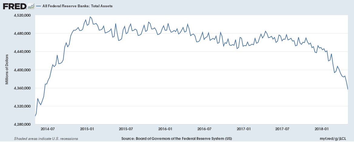
My first question to you is: If this was a stock chart, would you buy it?
Probably not, right? I mean, it clearly topped out a couple years ago, made a series of lower highs, and then started falling off the table in 2018.
In fact, it has plunged all the way back to June 2014 levels. Not a positive trend.
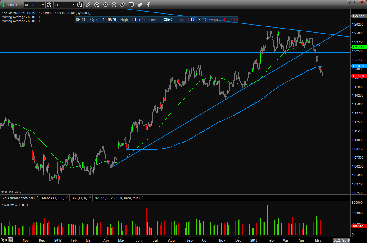
Here’s something else about this chart that’s worth noting. The action from about late-2017 onward looks an awful lot like, say, this chart of the euro currency.
You can see that, like my mystery chart, the euro spent several months topping out … and then began to plunge recently:
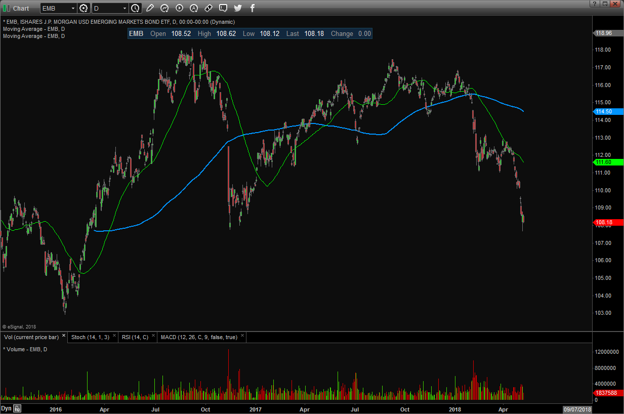
This is not the only place the pattern is evident. Check out THIS chart of the iShares JPMorgan USD Emerging Markets Bond ETF (EMB). This $11.4 billion ETF invests in bonds issued by riskier emerging nations, and you can see that it’s falling out of bed.
In fact, it just tanked to its lowest since right after Trump’s election in November 2016!
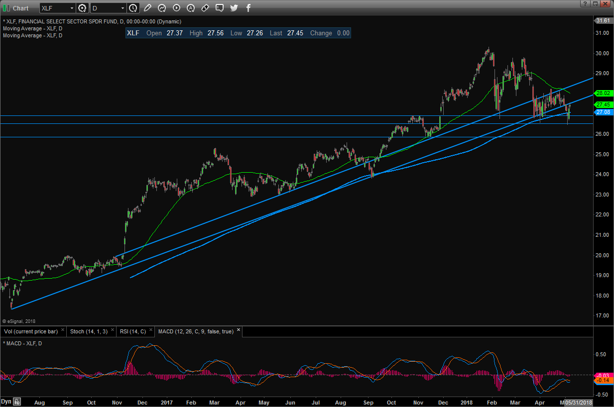
You could even argue that some U.S. stock charts are STARTING to look similar, albeit without as large of a breakdown yet. Take this chart of the Financial Select Sector SPDR Fund (XLF), the benchmark ETF for banks, brokers, insurers and other financial stocks.
It topped out in early 2018, and each subsequent rally has had less “oomph” behind it.
The XLF has also banged away at horizontal support and the 200-day moving average multiple times. So, it’s fair to question how much longer those levels will hold.
So, what does my mystery “uber-chart” show? Total assets on the Federal Reserve’s balance sheet. In other words, the cumulative, market-inflating, war chest of funny money built up during multiple rounds of QE!
This mountain of money topped out at around $4.52 trillion in 2015. Then it held fairly steady in 2016 and most of 2017, helping underpin and inflate asset prices all over the world.
But it’s clearly dropping now as part of the Fed’s unwinding process. The most recent reading of $4.35 trillion is down $170 billion from its peak, and the rate of decline is accelerating.
Now, some Wall Street pundits will tell you, “So what?” They’ll note that other central banks, particularly in Europe and Japan, haven’t started winding down like the Fed. But the rate at which they’re buying assets IS slowing. And almost every central bank has announced plans to stop completely later on.
Since bonds eventually mature, that’ll mean the cumulative ocean of liquidity on which assets are floating will start drying up. Look at this chart and you’ll see what I mean.
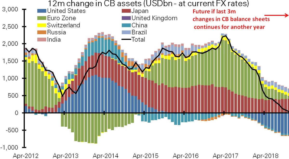
Barring a massive reversal or change in announced plans and intentions, assets at all the world’s major central banks will increase at a slower pace this year. This will be followed by actual shrinkage in 2019.
Now combine that with the fact the credit cycle is starting to turn — meaning loan defaults and delinquencies are beginning to rise again. Throw in the fact we’re very late in the economic expansion. Sprinkle over that the surging dollar … falling emerging-market currencies, stocks and bonds … and a likely peak in earnings and sales growth.
What do you get?
I’ll tell you what you don’t get: a recipe for powerful bull market gains.
That’s why I’ve been urging much greater caution, much more paring of losers in your portfolio, much lower market exposure, and most importantly, the adoption of a true “Safe Money” approach to investing.
Mike Larson is senior analyst at Weiss Ratings and editor of High Yield Investing.
Follow Mike Larson and subscribe to Weiss Ratings products here.
About MoneyShow.com: Founded in 1981, MoneyShow is a privately held financial media company headquartered in Sarasota, Florida. As a global network of investing and trading education, MoneyShow presents an extensive agenda of live and online events that attract over 75,000 investors, traders and financial advisors around the world.


