If we define relative silver as the ratio of the last close to the 200-day moving average, then this ratio will fluctuate, usually not very far from 1. The value of 1 means that the last close is equal to the 200-day moving average. Values below 1 mean that the last close is lower than the moving average and values above 1 mean that the last close is higher than the moving average. This three situations show three potentially different things.
Relative silver at 1 suggests that silver is now trading where it has traded in the last 200 days (on average). The easiest interpretation is that silver has not displayed one clear trend in the last 200 days. This might be the result of a sideways trend, a local top or a local bottom.
Relative silver below 1 suggests that the last close is lower than the average price over the last 200 days which is a sign that the price is potentially trending lower. Conversely, relative silver above hints that the current price is above the average of the prices from the last 200 days. This is a suggestion that the price is in an uptrend.
Let’s take a look at the long-term chart where we see relative silver along with the price of silver. This chart presents data for the time frame from 1975 to 2018. The price of silver is the red line (right axis) while relative silver is the blue line (left axis).

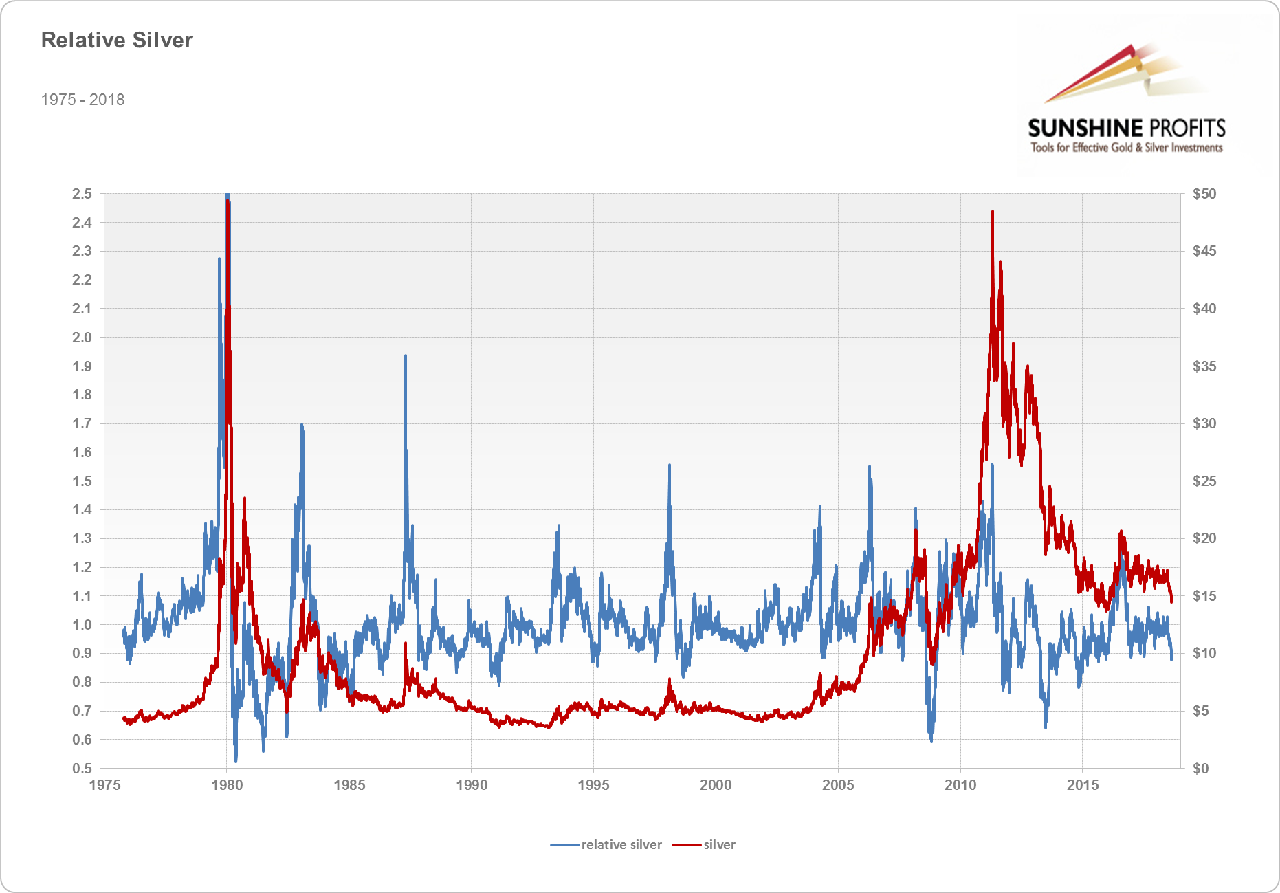
On this chart, if we take a look at times when relative silver crossed the 1 level decisively, this usually happened during downtrends. One extreme example would be the decline from the all-time high of 1980. On the flip side, the times when relative silver crossed the 1 level from below in a strong manner usually corresponded to uptrends. Examples of this could be seen in the 2000s when silver was in a clear uptrend. On the whole, the analogy between the 1 level and trends is not perfect but is seems to be there. It also seems to work on shorter time horizons than it does for relative gold, which is caused by the fact that silver is more volatile than gold.
The 1 level is not the only one to be observed. Actually, one factor seems even more important than the 1 level for the analysis of silver prices. Namely, extreme levels of relative silver might also be important for silver prices. First of all, in the long-term time horizon, extremely low levels of relative silver might be a contrarian sign just as extremely low levels of silver prices might be contrarian signs. If we take a look at the 0.8 level and the times went below this level usually coincide with periods when the local bottom was not far away. Examples of that include: the local bottom after the 1980 top, the bottom before the rebound in 1982, the 2008 bottom, the 2011 local bottom, the 2013 local bottom. So, while the analogy is not perfect, as there are periods when the 0.8 level did not immediately herald major bottoms, the 0.8 level could be used in conjunction with other signs to confirm important bottoms.
The other side of the spectrum are extremely high relative silver levels, which could potentially be contrarian signs for tops. If we take a look at the 1.4 level, we see that it frequently coincides with significant long-term tops. This was the case during the 1980 top when relative silver went above 3.5. This was a clearly extreme level. Other examples include: the 1983 top, the 1987 top, the 1998 top, the 2004 top, the 2006 local top, the 2008 local top, the end of the bull market in 2011. It does seem that this level was particularly useful to detect tops, potentially even better than relative gold.
We could also focus on different time horizons. Let’s take a look at the 2000-2018 chart.
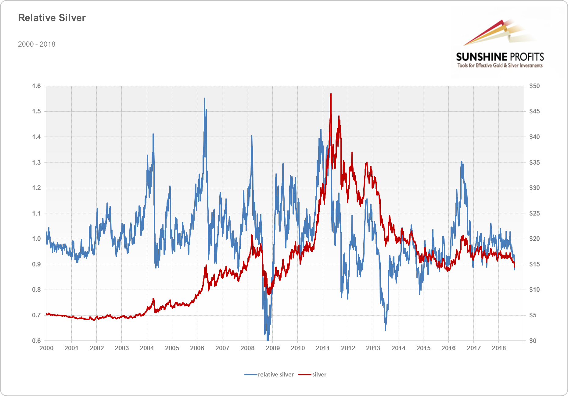
The 1.4 level might be interpreted as being a similar signal for the market as previously – it might suggest local tops. The other level we would like to discuss is the 0.9 level. In this time horizon, 0.9 or a move below it could signal bottoms just as 0.8 did on the previous chart. But we could also interpret significant breaks below this level as ones signaling shifts in the market. Examples of this include: the 2008 shift in the market when forced liquidation might have pushed silver sharply lower, and the end of the bull market and the shift to a bear market in 2011-2013. The 0.9 level seems like one to observe and to analyze together with other signals in order to identify what’s going on in the market.
We hope you have enjoyed reading the above definition. If you’d like to learn more about relative silver, and about silver’s most recent price swings and their implications, we invite you to sign up for our gold newsletter. It’s free and if you don’t like it, you can easily unsubscribe. Sign up today.


