Welcome to the 6th part of the Preparing for THE Bottom in Gold series. In the previous articles, we discussed the following issues regarding the final bottom in gold: staying alert, the likely timing of the bottom, the gold to silver ratio, the ratios between gold, bonds and gold stocks, and finally, we elaborated on the process of purchasing precious metals, with the emphasis on the “how to buy” issue.
In today’s essay, we continue the discussion from the latest issue, by providing further details regarding the moment of purchase. Namely, we examine what to buy. Even if the length of this article seems discouraging, we still encourage you to read it as it’s one of the most important analytical pieces that we have published in the past years (the gold portfolio structuring essay and research on position sizing are also on the podium – you can see a long-story-short version of the latter in our Gold Trading Beginner’s Guide). If you’re short on time, you might want to go directly to the summary of this essay, but even if this is the case, we still encourage you to read the full version of this essay later on (perhaps with a cup of your favorite coffee). Having said that, let’s start today’s analysis.
At first sight, the “what to buy” question seems trivial and not worthy of a detailed analysis.
What to buy? Gold, of course! The king of metals! – would be the immediate reply of gold fans.
What to buy? Silver offers explosive potential – bet the farm and buy silver! – silver investors would shout.

What do you mean what to buy? Gold stocks and silver stocks – they provide the biggest bang for the buck – a mining stock enthusiast and many traders would likely respond.
What to buy? Platinum, as it’s most heavily undervalued – it was above $2,000 in 2008.
Others would claim that junior mining stocks are the place that the biggest gains can be made and some would argue that all of the above are “has-beens” and that palladium is the current name of the game.
Is the reply to the “what to buy” question really that simple? Should you focus on just one of the above approaches? Or maybe diversify between them, and if so, which parts should you include in your precious metals portfolio and which ones should be left out?
As you see, choosing what to buy may be simple, but not easy. It takes thorough analysis and strategy to build and maintain a healthy precious metals portfolio as all the above approaches need to be analyzed and accepted, discarded or combined in a compromise.
Let’s start discussing the above options by ruling out those that don’t appear to be good choices.
Platinum
The first (worst) case seems to be platinum. It indeed rallied above $2,000 in the past, but that doesn’t say anything about the likelihood of us seeing such prices again in the near (or even more distant) future. In particular, it doesn’t say anything about platinum’s possible outperformance of other parts of the precious metals sector. Technically, the price of platinum is very weak – its ratio to gold moved well below 1, and has been trading below it for more than 2 years. That’s more than enough that is needed to confirm a breakdown. At the moment of writing these words, the platinum to gold ratio is just after a move to new lows and just after it became less valuable than palladium. The technical picture is not the key bearish factor – the fundamental picture is. As we have already discussed, both platinum and palladium are industrial commodities, which are sensitive to the level of business activity (auto sales) and industrial demand. In fact, the automotive sector accounts for about 40 percent of the overall demand for platinum as it’s mainly used as a diesel exhaust emissions control catalyst. The problem is that the diesel market share is declining and it’s likely to continue to decline. Consequently, platinum has little reason to rally and good reason to continue to underperform in the long run unless new applications for it are found. That’s not a bet that one wants to take in case of long-term investments, so we’re crossing platinum and portfolio’s including it off our “favorites list”.
Before moving to palladium, we would like to add that since platinum is now cheaper than the former, we could see a substitution effect come into play that could generate additional demand for platinum. Still, let’s keep in mind that it takes some time for the industry to adjust and the adjustment would not be complete anyway. Overall, it doesn’t seem that this factor is enough to make the case for long-term investment in platinum appealing.
Palladium
If platinum is out, then perhaps we should turn to palladium, as it’s been performing particularly well in the last two years… Not necessarily. The problem with palladium is that there are not much more good things that we can say about it than we already have. Well, it’s potential seems more promising than the one of platinum, but it’s still likely to suffer due to the same fundamental reasons in the coming years. Almost 85% of demand for palladium comes from the automotive industry (it’s used instead of platinum in the case of the gasoline-powered cars), which makes it effectively an industrial metal, more similar to copper than to gold. So, should it really be a part of a precious metals portfolio? It could, if it had a promising outlook and this also seems to be a problem. While it’s likely to outperform platinum (just as gasoline cars are taking over diesel cars), it has a major problem in the form of the long-term rise of the electric car market share. These cars will not dominate the market shortly, but the trend is already present and since markets are generally forward-looking, the prices could reflect this trend much sooner, which doesn’t bode well for the prices of palladium in the following years (at least compared to gold and silver). Some might say that fuel cells will support the demand for platinum and palladium, but that doesn’t seem to be the case.
From a technical point of view, we see that palladium has been outperforming the precious metals sector for a few years, but the 2000 – 2009 performance was very weak. The biggest run-up – in addition to the current one – was seen right after the 2008 bottom ($160.30) when palladium rallied to $862 in 2011 (rallying by almost 438%). For comparison, silver soared from $8.40 to $49.83 (rallying by over 493%) – the latter still outperformed.
So, when did palladium exactly outperform? When the precious metals sector – in general – was declining. It’s no wonder that this happened – after all, the general stock market has been soaring and the vast majority of demand for palladium is of industrial nature.
Since we want to enter the precious metals market and exit it close to the top, then it’s the performance during upswings that is most important, but one can say that the above is at least “interesting” about palladium.
What’s less interesting is palladium’s performance in the previous great bull market that we saw 4 decades ago. Palladium rose from below $40 to about $350, while gold moved from below $40 to about $850 and silver moved from below $1.50 to about $50. Palladium was a clear loser in that race and since history tends to rhyme, it doesn’t make us thrilled about palladium’s future performance.
All in all, palladium doesn’t seem to be winner and both its fundamental picture and the analogy to the previous great bull market make us reluctant to include it in the long-term investment precious metals portfolio. Consequently, we will not add it to our precious metals portfolio. Its good performance in the recent years is almost certainly just a reflection of a (both real, and projected) move from diesel- to gasoline-powered cars that doesn’t show real outperformance in the PM sector. Since both platinum and palladium are likely to be at a disadvantage due to the rise of the electric cars, it doesn’t seem that they should be a part of one’s long-term precious metals portfolio. However, we will still check if it adds value to such a portfolio with emphasis on its performance during bull markets.
Senior Mining Stocks
Should miners be included in a long-term oriented precious metals portfolio? Most likely yes, but we don’t want to give the verdict so early in this essay.
The reason for including gold stocks and silver stocks in the detailed calculations is that they were the part of the precious metals market that soared most substantially in the early part of this bull market (until 2004) and they performed just as well as the underlying metals in the next few years, providing some diversification (until early 2008).
Miners didn’t perform well since that time – they had their moments, especially the post-2008-bottom comeback – but in general, they underperformed gold. Their 2016 run-up (in both absolute terms and relative to gold) shows that this part of the precious metals market is far from being dead and that it shouldn’t be ignored, especially in the early parts of a bigger uptrend. The above seems to be enough to qualify senior miners for more detailed analysis.
Junior Mining Stocks
There are a few analytical problems with juniors, which is probably why there are no other detailed analyses of this sector in the portfolio context.
First of all, there is no good proxy for the sector that would cover the entire bull market. The same is the case with silver stocks and while in the case of the latter it’s the only problem, juniors also involve another issue. Namely, it’s difficult to select the best companies as their prices are easier to manipulate and more prone to sudden moves both up and down. This makes statistics based on junior mining stocks prices and volume readings less reliable than those that are based on analogous variables in the case of senior mining stocks. The algorithms that we are able to apply in the case of our gold stocks and silver stock selection tools are likely to provide reliable rankings given that the data is sound. If a given stock’s price can be moved by many percent on a daily basis based on a single big transaction, as may be the case with juniors, then the data may not be sound.
Naturally, one could say that they will use other means of selecting junior mining stocks, but let’s keep in mind that if one wants to truly dig into a given company, they would need to spend a month or so on it, going through the financial statements, including footnotes, checking the background of the executives and so on. Given the multitude of junior mining stocks, before one would be done with only 20% of precious metals juniors, the analyses of the first companies would already become outdated. Yes, one could naturally rely on someone else’s analysis (subscribing to a junior mining stock newsletter and trusting their reviews), but in this case, the problem becomes the danger with making sure the author of the analysis has really gone through the mentioned effort and that they have no personal business in promoting a given company.
There’s also the transactional difficulty in some cases – large investors can’t quickly buy or sell junior miners without significantly affecting their prices.
So, while it may be difficult to effectively invest one’s long-term investment capital in selected junior mining stocks, it might still be possible to reap the potential benefits of investing in the sector by either investing in a broad portfolio of juniors or by buying a diversified ETF.
The proxy for the junior sector that we will use will be the GDXJ ETF. At first sight, looking at the GDXJ:GDX ratio (and the SGDJ:SGDM ratio for confirmation), junior mining stocks are simply more volatile than producers so it seems that they might be useful to increase the long-term gains during a big bull market. Consequently, we will add GDXJ to our detailed calculations.
Still, we will not create and check portfolios that have only junior mining stocks – the latter will be treated as an addition only. The reason is that no matter how favorable the data might be, it is still rather limited (GDXJ started trading in late 2009) and thus one needs to keep some level of skepticism regarding the outcome. Consequently, it doesn’t seem justified to put a huge amount of one’s money (percentage-wise) into this sector just yet.
Moreover, what is important in the above and below analysis is the performance of the entire sector – not individual junior mining stocks. Naturally, you may be able to pick the top 10% of juniors, but when making a few “top picks,” one can’t (or at least shouldn’t) dedicate a lot of capital to it as it would make the entire portfolio too risky (company specific risk is huge in the case of junior miners, like a lawsuit regarding important property since a given junior could own just a few of them, a change in environmental regulations regarding a relatively small area, accidents in mines, no precious metals where they should have been and so on). In the case of big companies, the risk is generally being spread among many mines and properties, so you often get some decent diversification even in the case of just one company. So, even if you were confident in the stocks that you chose, they can’t (prudently) be more than a small part of the long-term investment portfolio – and definitely shouldn’t be its core.
Silver
We have already featured a few reasons to include silver in more detailed calculations, but let’s restate a few of them here:
- Silver was the clear winner of the 1970s bull market.
- Silver was the clear winner of the 2000 – 2011 bull market among metals (silver’s price increased more than 12-fold).
- Silver is the second most popular precious metal.
- Silver has a very favorable fundamental picture.
- Silver moves more or less in tune with gold, sometimes lagging and sometimes outperforming, making it possible to reap diversification benefits by investing in both.
All in all, without further discussion, silver needs to be included in more detailed calculations.
Gold
Can one imagine a precious metals portfolio without gold? Of course – if it was only justified from the risk to reward point of view. But it isn’t. Gold’s low volatility (compared to other assets mentioned earlier) allowed it to hold up relatively well during the last couple of years, which makes is a great stand-alone investment. In fact, only palladium’s rate of return between the low of 2000s and the current price is bigger and this is likely a long, but still one-time rally caused by a move from platinum to palladium (a derivative of a move from diesel to gasoline). After all, once investors discount the mentioned move in the automotive industry, the potential for further price movement (platinum vs. palladium) will be gone. So, gold still appears to be the current winner in this bull market. Would it therefore be understandable to exclude it from detailed calculations? Absolutely not. Gold’s performance in the portfolio context and on a stand-alone basis definitely needs to be examined more closely.
Methodology
Before moving straight to the numbers, we would like to briefly discuss the logic behind them. There are many numbers that could characterize a given portfolio (owning just one asset is still a portfolio), but we’ll use the most common and widely understood ones: the rate of return, the standard deviation (measure of volatility) and the Sharpe ratio. The latter is the rate of return minus the risk-free rate (which we’ll assume is 1% as that’s approximately the 3-month T-bill rate) divided by the standard deviation. In other words, it shows how much extra gain (over the risk-free rate) a given portfolio was able to provide for a unit of risk (it’s most often the case that risk is measured by volatility a.k.a. variability). The Sharpe ratio is the golden standard of comparative portfolio valuations.
We will compare these 3 values across portfolios, with the emphasis on the rate of return and the Sharpe ratio.
The standard deviation (proxy for volatility) is generally viewed as risk, but it could also be viewed as a source of opportunity – volatility means that by exiting or entering the market (or changing the exposure to the precious metals market), one could additionally increase (or decrease) the overall rate of return.
Finally, we will provide a graphical representation of performance of the most interesting portfolios (those that will excel in some way in terms of numbers). This should make it clear which portfolios are most appealing and perhaps indicate that some strategies will make more sense than others. It will also serve as a confirmation that the selected portfolios are indeed appropriate and that their favorable numbers (the ones discussed earlier) are not heavily affected by just one session or a favorable week.
Speaking of making sure that the numbers are correct, the very important question that is usually not considered when conducting such comparative analysis is data selection. Should the numbers and decisions be based on the past 3 months, past year, past decade or maybe the previous 2,349 trading days (before you ask – that’s just a random number)? One can measure all of them, but the point is to measure the ones that matter. In analogy to dieting, many people advocate a “balanced diet”, but there’s no such thing. There’s only a diet that can be balanced with a particular goal and circumstances in mind (someone training for the Iron Man competition will need something entirely different than someone who can’t move much due to an illness or someone who wants to lose weight). Knowing the goal makes it possible for one to find a balanced solution or a few of them that might appear promising (for some people aiming for weight-loss, a low-carb diet will be perfect, while others will get best results from a low-fat approach). The same is the case with data for portfolio analysis.
Our goal here is not to prove superiority of one asset over other ones just for the sake of it. Our goal here is not striving to find evidence that one part of the precious metals market could be better than other parts in some cases. Our goal here is taking advantage of the epic buying opportunity in the precious metals sector and making the most of the upcoming long-term rally in it. By making the most, we mean making the most money, while not being exposed to extreme risk.
Keeping this in mind, there are a few ways in which it makes sense to measure the data:
- The 2000/2001 bottom – today – this period is justified because it takes into account the entire bull market up-to-date. Since we are aiming to profit on its continuation, the data from it (including both upswings and downswings) should be useful. The important point that needs to be made here is that the bottoms in gold, silver and mining stocks were formed on different days, so to make the calculations more neutral, we will make them separately for each case (gold’s 2001 bottom – today, silver’s 2001 bottom – today and the HUI Index’ 2000 bottom – today) and then analyze their average. This period is most important in terms of completeness.
- The first huge upleg, meaning the 2000/2001 bottom – the top in gold. Since we are aiming to profit on another huge upswing in the precious metals market, the best analogy seems to be to the most recent analogous period. We’ll use gold’s top as it’s relatively close to tops in silver and the HUI Index and because this date is most representative regarding the end of a multi-year rally – that’s the date that anyone will tell you if you ask them when the previous long-term rally in PMs ended. As above, we will use three sets of data, depending on the bottoming time and then we’ll use the average of outcomes. This period is most important in terms of direct analogy.
- The huge decline that followed the 2011 top (gold’s top – bottom in metals/miners). While we don’t plan to be investing during major declines, it will still be important from an analytical point of view to check how different portfolios behave under such circumstances. Metals and miners didn’t bottom at the same time and the difference is quite important, so we’ll use two sets of data – one ending in December 2015 (metals’ bottom) and the other ending in January 2016 (miners’ bottom). This period is not as important as the other ones, but it provides us with details regarding volatility / risk.
- The recent big upleg: the metals/miners bottom – today. The portfolio’s performance during the most recent upswing could indicate the performance in an analogous (yet bigger) move in the future. This period ends with today’s date and starts with either the metals’ or miners’ bottom in 2015 or 2016. As previously, we’ll use two datasets and average the outcomes. This period is most important in terms of recency.
All datasets end on August 10, 2018 (that was “today” when we were working on this report). About a month later, when this essay is being published, the calculations remain up-to-date as nothing major happened in the meantime.
All calculations are based on daily closing prices. Moving to weekly closing prices might change the outcome a bit, but it would not change them in even a moderately meaningful way.
Moving back to the discussion of the dataset, we chose to base our calculations on the current bull market and not the bull market of the 1970s because back then there were many factors in play that are not in play right now and that are not likely to become an issue in the future (at least not in the next several years).
The 1970s were different because of very high interest rates. Sure, the rates are being increased now as well, but they are nowhere near the levels that Paul Volcker set about 40 years ago. The rates are unlikely to be raised as high due to the enormous size of the debt that needs to be serviced.
Moreover, before the 70’s bull market, the price of gold was fixed, but this wasn’t the case for mining stocks. Consequently, the latter rallied even before metals did and thus the intra-sector dynamics were specific to this particular set of circumstances (metals had to catch up while miners were reluctant to outperform).
Finally, the general stock market’s performance was entirely different 40 years ago. It’s performance back then was more or less weak (with the exception of 1975). In contrast, the main stock indices have been thriving in the past years.
While the above doesn’t imply that the bull market will not continue this time or that gold and silver will not enter a speculative buying frenzy in a few years, it does imply that since the times are different, the way the precious metals market soars in the following years may be very different from the way it soared back in the 70s. Some things seem to be repeating (silver outperforms near the end of a given rally – that’s visible from different perspectives), but others might not (the mining stocks’ poor performance).
Earlier in this essay, we described what individual assets we were going to evaluate, but the question remains what combinations of assets are also worth investigating. At first sight, it seems that we might check all possible combinations and it is indeed the case, but giving it a second thought reveals that we have good reasons to include at least gold (safest choice of the listed ones) and silver (top performing metal) in all of them. This significantly lowers the amount of combinations. For instance, we’ll not check the performance of a portfolio comprised only of gold stocks and palladium as both are very volatile. Please note that if it appears that something performs particularly well, it might still be added and additional calculations could be made.
As far as mining stocks are concerned, we’ll use the HUI Index as a proxy for them and then SIL as an additional proxy for silver stocks. The only alternative that is priced long enough to be included in the long-term calculations is the XAU Index, but it includes companies that hedge their production, which lowers the valuation.
So, the portfolios that we will check, in addition to gold, silver, mining stocks (the HUI Index, SIL and GDXJ), and palladium, are:
- Gold + Silver
- Gold + Silver + Palladium
- Gold + Silver + HUI
- Gold + Silver + Palladium + HUI
- Gold + Silver + HUI + SIL
- Gold + Silver + HUI + SIL + GDXJ
Adding SIL to only two portfolios and GDXJ to only one portfolio makes sense as we have limited data (since 2010 and late 2009, respectively, as that’s when this silver stock and junior ETFs were launched) and we have to use gold stocks for earlier calculations anyway – fortunately, they move in tune, so it seems that this approach is justified. Moreover, GDXJ moves quite in tune with the HUI Index, with the key difference being volatility (juniors have been more volatile), so we didn’t include the portfolio that includes gold, silver, HUI and GDXJ as there is little diversification benefit from adding just GDXJ to the HUI Index.
Also, the above is the result of us adding the SIL and GDXJ ETFs to the most promising (in our view) of the mentioned portfolios – in order to check if it would improve it or not. Adding it to portfolios that don’t perform as well doesn’t seem to change anything as they would not be our first choice anyway.
Note: in the case of the Gold + Silver + HUI + SIL portfolio, we use the 0.25 weight for all of them after we can include SIL in it (since 2010) and we use the following weights beforehand: 0.25 for gold, 0.25 for silver and 0.5 for HUI, as the latter serves not only as itself (0.25 weight), but also as a proxy for SIL (another 0.25 weight).
The Gold + Silver + HUI portfolio is featured with equal weights (1/3 in case of all of the above) and also with the 50% weight for the HUI. The Gold + Silver + HUI + GDXJ + SIL portfolio is featured with 0.25 weights for both gold and silver and with 1/6 weights for HUI, SIL and GDXJ.
The latter is needed to make the last 3 portfolios clearly comparable – without a stable division between metals and miners we could get either better or worse choices not thanks to including a given asset in the portfolio, but thanks to increasing or decreasing the share of mining stocks in general (and we already have other means to check it, so we don’t need to do it in the mentioned way).
Before moving further, we would like to digress a bit. At this point you might be suspicious about SIL’s leverage and the reason could be the structure of the fund’s holdings. Is SIL performing well, simply because it includes a lot of juniors? If this was the case, it would likely be pointless to diversify into both juniors and silver stocks as that would be more or less doubling the same action and overemphasizing the junior sector instead of simply diversifying into it. Or maybe SIL is performing well because about a quarter of its holdings is in stocks that are primarily listed on the London Stock Exchange (Polymetal International and Fresnillo) and thus the GBP/USD currency exchange rate is a large determinant of the performance of the fund?
The latter is most likely not the case – we checked SIL’s performance relative to GDX and HUI and it doesn’t seem to be driven or connected to the fluctuations in the GBP/USD currency pair. The former doesn’t seem to be the case either as there appear to be visible trends in the SIL:GDXJ ratio that are not explained simply by leverage (which seems to be the case with the GDX to GDXJ ratio). Consequently, it seems that both GDXJ and SIL are worth to be considered separate parts of the precious metals portfolio, the former as a proxy for juniors in general and the latter as a proxy for silver stocks in general.
The final note before moving to the results of the calculations is that we use logarithmic rates of return instead of regular ones in order to simplify the math behind the calculations and to make sure that using arithmetic means doesn’t artificially increase the rates of return. This doesn’t change anything as far as practical implications are concerned – a portfolio with the highest log rate of return will also have the highest regular rate of return.
Precious Metals Portfolios – Results
Let’s start with the results based on the entire bull market up-to-date (2000/2001 bottoms – today).
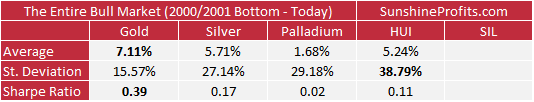
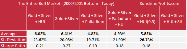
Even though we are just starting to look at the numbers, the analysis of the broadest dataset already provides us with a kind of “summing up” information. The all-said-and-done winner of the entire comparison is simply… Gold. On average it provided greatest profits and the biggest Sharpe ratio. In terms of the average yearly gains, it was just a little above the other top portfolios: Gold + Silver, Gold + Silver + HUI and Gold + Silver + HUI(0.5), and in terms of the Sharpe ratio, it was the stand-alone winner, due to its relatively low volatility. The standard deviation (variability of returns) was much lower than what we see in the case of other portfolios.
The above indicates that if one wants to buy into the precious metals sector and then hold into these gains and never sell (or sell many years later) and they don’t have time to make adjustments in their portfolio or nobody trusted who can do this for them, then gold is most likely the best choice.
But is the above enough to say that gold is superior to all other portfolios in general? Some might say so at this time, but we think it would be wise to check other datasets before making the final judgement. After all, many investors will prefer to get out of the precious metals market when things look bad from the medium-term point of view (just like we exited the precious metals market with long-term investments in April 2013) and have the ability to adjust their positions.
Either way, palladium is the clear loser – its Sharpe ratio is at a mere 0.02, as palladium barely outperforms T-bills despite significant volatility. The portfolios that include it are a bit better off in terms of volatility but visibly worse off in terms of profitability and in the case of the Sharpe ratio.
On a side note, there are no numbers for either SIL or the portfolio that includes it, as it was not traded for the entire period that was analyzed.
Next, let’s take a look at the statistics for the first huge upleg in the PM sector.
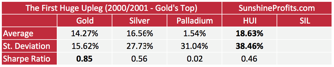
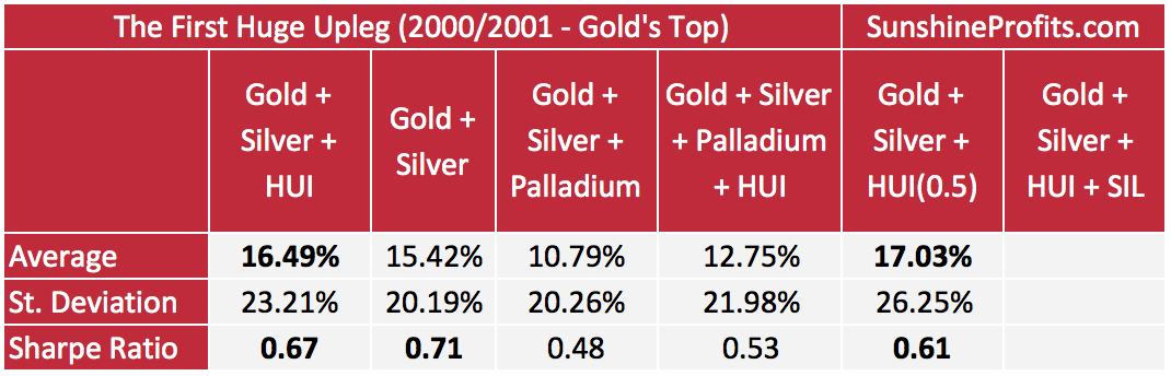
If we take the huge rally into account, then mining stocks are the winner in terms of gains. However, they are also the winner in terms of volatility, so gold still comes in first in terms of the Sharpe ratio.
The portfolios that include gold, silver and mining stocks (differing in weights) provide returns that are close to the record profits from the HUI and at the same time (much closer than gold only) while their volatility was more or less between the one of gold and the HUI.
Consequently, if the primary focus is on the long-term profitability and one is willing to accept a considerable (but not extreme) level of risk, the portfolios including mining stocks might be most favorable.
The interesting fact is that both profitability and variability of the portfolio including gold, silver and the HUI (with a 50% weight) were superior to the portfolio consisting only silver.
Another interesting fact is that the performance of palladium was very weak – it didn’t provide almost any benefit above T-bills and at the same time it was one of the most volatile assets.
Having discussed the huge upleg, let’s take a look at the numbers regarding the huge decline.
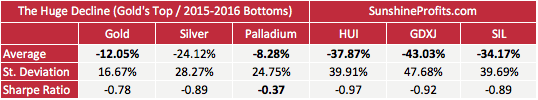
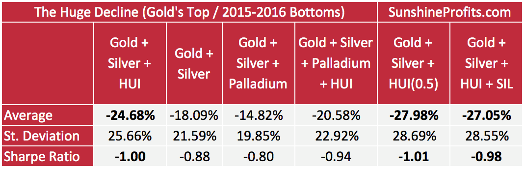
The name “huge decline” is not accidental – the declines ranged from 8% to about 43%, annualized.
The “best” performing asset in this case was palladium, which declined by only 8.28%. Except for the 100% palladium portfolio, all the other portfolios had worse results than the 100% gold one. So, for those who wanted to stay in the precious metals market during the decline, out of the above choices, gold and palladium were the best places to be. However, since palladium’s performance during the huge upleg was so weak, it doesn’t seem like a good choice for a long-term buy-and-hold strategy. For this strategy, gold is still the winner.
Mining stocks (in particular junior miners) were devastated by the decline, and while the portfolios including them also suffered, the losses were considerably smaller. Interestingly, silver stocks (SIL) didn’t fall as hard as gold stocks did.
Having said that, let’s examine the most recent past.
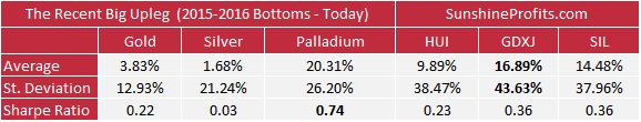
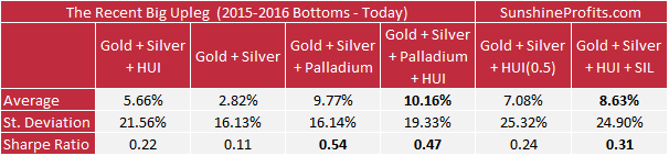
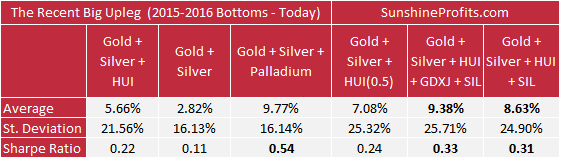
The winner in terms of gains is the GDXJ ETF with palladium only 0.12% behind and the third place belongs to the SIL ETF – silver stocks. Either way, if we don’t count the palladium performance, mining stocks were the top performing part of the precious metals sector – they outperformed both key precious metals. The palladium price, however, was considerably less volatile and this makes its Sharpe ratio the highest out of the analyzed portfolios. The silver medal goes to the Gold + Silver + Palladium portfolio – the profits were smaller, but the volatility was smaller as well and overall, the Sharpe ratio was higher than in the case of the portfolios that didn’t include palladium at all.
Gold was – as in all previous cases – the least volatile, but it was not particularly profitable.
Moving back to the profitability winners, the portfolios that included mining stocks were also quite profitable, and the Gold + Silver + HUI + GDXJ + SIL portfolio took the lead among them. This portfolio and the analogous one without juniors had the highest Sharpe ratios out of the portfolios that included miners. Additionally, both of the mentioned portfolios were characterized by the highest Sharpe ratios if we exclude anything involving palladium (which is useful as that’s the only dataset in which palladium was performing well).
In particular, it’s worth noting that the Gold + Silver + HUI + GDXJ + SIL also had the highest Sharpe ratio out of the non-palladium portfolios.
Precious Metals Portfolios – Summary
Earlier in this essay we wrote that our goal here was to take advantage of the epic buying opportunity in the precious metals sector and make the most of the upcoming long-term rally in it. By making the most, we meant making the most money, while not being exposed to extreme risk.
We also wrote an early summary below the statistics based on the entire bull market up-to-date.
Namely, these statistics indicated that if one wants to buy into the precious metals sector and then hold into these gains and never sell (or sell many years later) and they don’t have time to make adjustments in their portfolio or nobody trusted who can do this for them, then gold is most likely the best choice.
Gold wasn’t the top performer in terms of profitability during the upswings (both the biggest rally and the most recent one), but its performance on average during them was at least decent. Gold’s true strength came from the ability to resist the free fall to a considerable extent, while silver and – in particular – mining stocks fell hard. Overall, the above qualities make it a top choice for some investors.
What about the top choice for the investors who want to maximize profitability, accept some level of risk and have time to make adjustments in their portfolios and/or someone trusted to do it for them?
In this case, the Gold + Silver + HUI + SIL and Gold + Silver + HUI + SIL + GDXJ portfolios both seem to be the winners. These portfolios are not included in the first table which is based on the largest dataset, but the Gold + Silver + HUI (50% weight) is one of the top performers in terms of profitability and since the SIL outperformed the HUI in both: upswings and downswings, the performance of the portfolio that includes SIL would be likely better than the one without it.
Adding junior mining stocks to the portfolio also adds to the portfolio’s performance without damaging its Sharpe ratio (taking into account both recent upswing and the big decline). Yes, adding junior miners means adding some volatility, but if the portfolio is to be managed actively, at least in some way, then this may not necessarily be a disadvantage – it could be something positive that allows the investors to make more money thanks to the medium-term price swings.
The Gold + Silver + HUI + SIL + GDXJ was the winner in terms of profitability and the Sharpe ratio among the non-palladium portfolios in the recent upswing. In the case of the first huge upleg, the two most profitable portfolios were Gold + Silver + HUI and Gold + Silver + HUI (50% weight). The only difference between them are the weights (1/3, 1/3, 1/3 in case of the former and 1/4, 1/4, 1/2 in case of the latter). To be 100% clear, the HUI Index alone was the top performer, but the volatility was extreme and the Sharpe ratio was significantly affected – it was 0.46, while both of the mentioned portfolios had this ratio above 0.6.
Out of these two portfolios, the Sharpe ratio was higher when the share of gold stocks was lower, even though the profitability was higher (the difference was not huge, though). The reason for including the portfolio with a 50% weight in gold stocks was to make it comparable to the one that also features silver stocks and the one that includes both silver stocks and juniors. We now know that the both latter asset classes add value as they both increase the profitability and the Sharpe ratio. In the case of the most recent upswing analysis, the Sharpe ratio for the Gold + Silver + HUI + SIL + GDXJ portfolio was 0.07 higher than the Sharpe ratio for Gold + Silver + HUI (0.5).
If we assume the same outperformance (0.07) and apply it to the first huge upleg statistics, we get a Sharpe ratio of 0.68 – which is slightly above the one for Gold + Silver + HUI (equal weights) portfolio (0.67).
Moreover, since SIL has been on average performing better than the HUI, it could have been the case (if SIL had been trading when the bull market in PMs started) that the Gold + Silver + HUI + SIL portfolio’s profitability during the entire bull market was even greater than that of gold. Junior mining stocks might have further increased it, but we can’t say so with 100% certainty.
Still, the above is quite probable, which means that the buy-and-forget strategy would have yielded similar results over the years in the case of the mentioned portfolio and gold. However, if one had been able to exit the precious metals market at least partially and at least temporarily sometime during the huge decline, the Gold + Silver + HUI + SIL portfolio (and its counterpart with juniors) would have been more profitable in the end.
If one had been able to limit their exposure to the precious metals market considerably during a sizable part of the huge decline, then the outperformance of the Gold + Silver + HUI + GDXJ + SIL portfolio would have been quite clear and quite significant.
Precious Metals Portfolio Charts
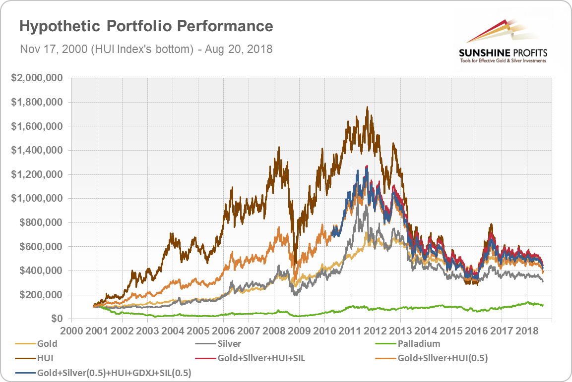
The above discussion might be difficult to comprehend based on the numbers alone, so we prepared charts that feature the key portfolios and their performance over time. To be objective and not skew the outcome toward a particular asset, we will show you three charts. In each case, the portfolio will start with $100,000 at the beginning of the bull market. The difference is that in the first chart, the bull market begins when gold bottomed (we’ll use the Feb 20, 2001 bottom as a starting date as that’s the day from which gold started to climb in a visible way). In the second chart, the bull market begins when silver bottomed, and in the third chart, the bull market begins when the HUI bottomed.
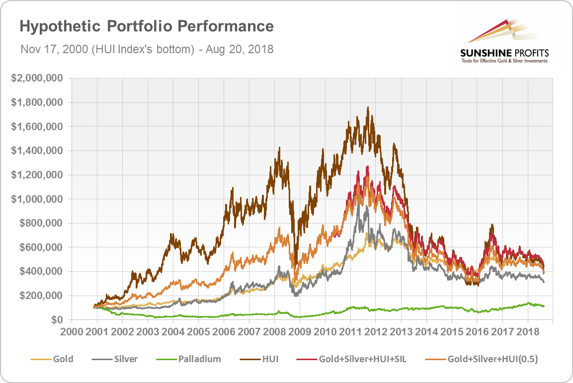
The chart below shows the portfolios’ performance since gold’s bottom.
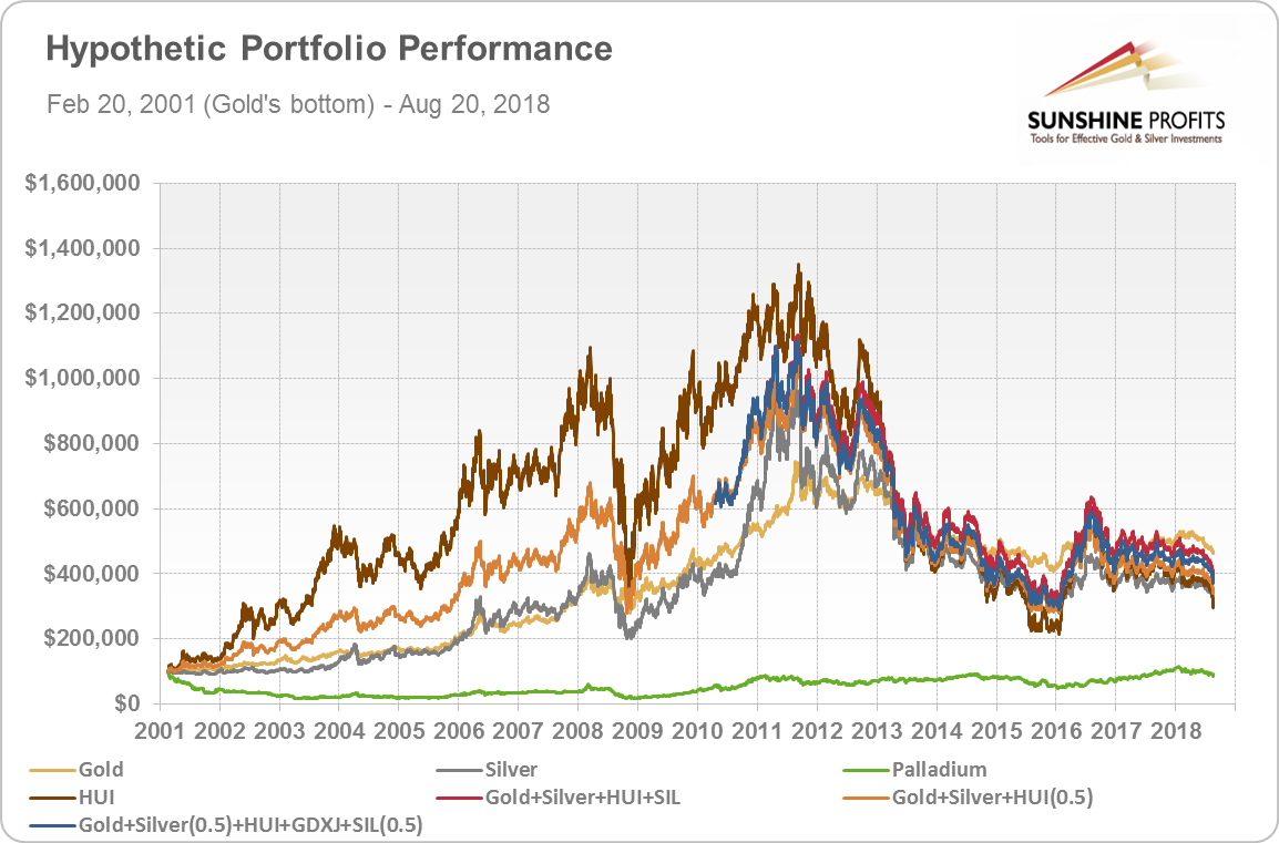
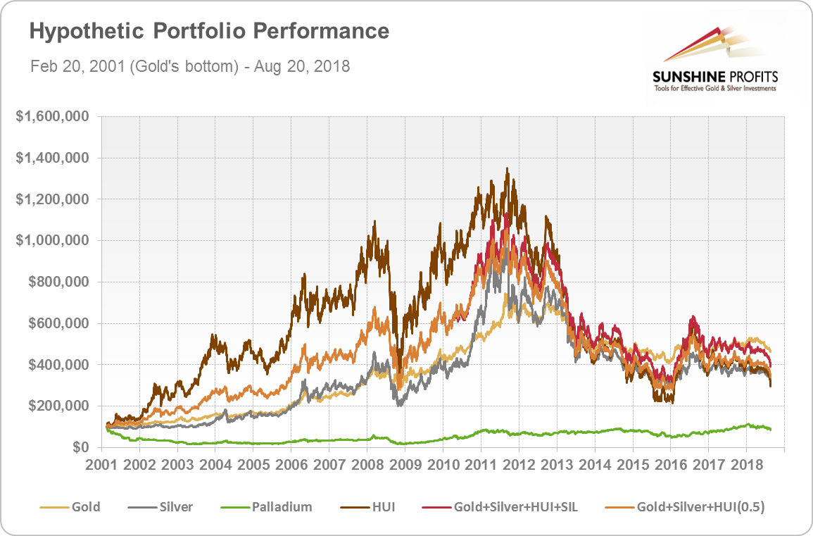
You might want to click on the chart to expand it – if it doesn’t expand and you are not reading it on our website, you can access the version with full-size charts on it.
The first thing that comes to mind while looking at the chart is the striking outperformance of the HUI Index for most of the time and the even more striking underperformance during declines. It provided both highest gains and biggest losses (note where the brown line was during the 2015 bottom). At the end of the dataset (August 10, 2018) it was more or less at the bottom of the “reasonable portfolios”. The remaining portfolio – palladium – was not even close to the rest in terms of profitability.
What were the three top performers? Gold (golden line) and the Gold + Silver + HUI + SIL (red line) and the same portfolio with added juniors (blue line) – the difference between them is minimal.
The red and blue lines starts in 2010 as that’s when the SIL was launched – before that, the orange line serves as a proxy (Gold + Silver + HUI with 50% weight).
Please note how the red line performs relative to the brown one (HUI) – the former is still volatile, but ultimately the value of the portfolio declined to $349k instead of dropping to $280k, like it was the case with the HUI Index. The value of the portfolio was almost 25% higher.
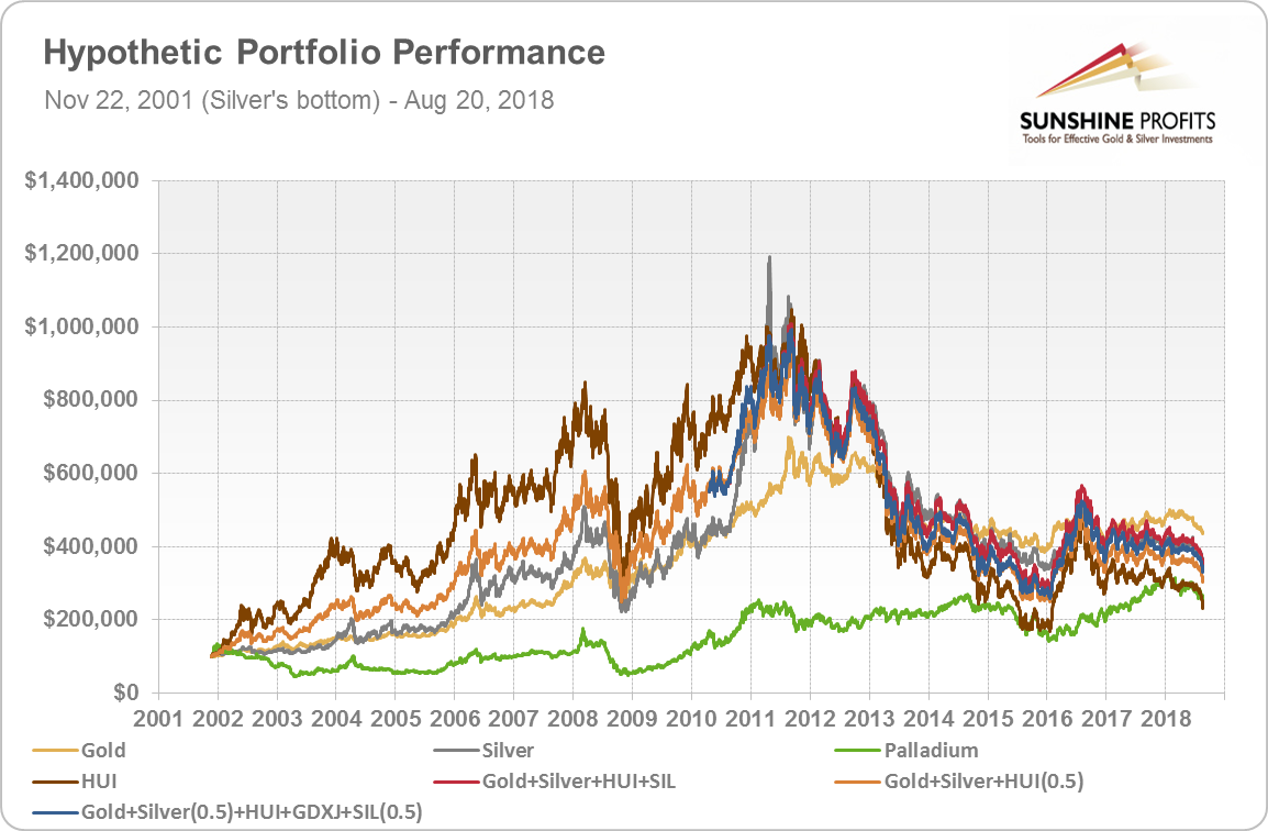
If we look at the above with silver and its bottoming price in mind, we’ll see that the performance gap between silver, mining stocks and the portfolios that included them is quite narrow. From this perspective, gold wins with the Gold + Silver + HUI + SIL (and its counterpart with juniors) portfolio being right behind it. Silver is just below the latter and the worst 2 performers are the HUI Index on its own and palladium.
The interesting fact is that if we start the dataset with silver’s bottom, it appears that the biggest gains could have been made in silver – the spike on the above chart confirms it. It’s not the truth, though.
The profits that could have been made when getting into gold stocks right at their bottom are higher than the analogous ones for silver and the above chart clearly confirms it.
The outperformance of mining stocks is very visible, but the same goes for its decline. The overall winners (in terms of profitability) from this perspective are the HUI Index and the Gold + Silver + HUI + SIL portfolio (the junior counterpart is not far behind). Gold is visibly weaker, silver falls behind and palladium is barely profitable.
Based on the differences in outcomes you see why we have decided to feature all the above charts instead of choosing just one – no matter which one we would choose, it would still be biased.
There is only one portfolio that wins in all three perspectives and that is the one that we emphasized based on the statistics earlier in this essay: Gold + Silver + HUI + SIL. Gold on its own provides good gains along with relatively low volatility and both statistics and charts confirm it. However, the mentioned mix of gold, silver, gold stocks and silver stocks seems to provide an even greater opportunity for those who can accept the increased risk (volatility) and have at least some time (or professional assistance) to manage their portfolios. The additional benefit of this portfolio comes from the ability to exit the market at the most unfavorable moments.
Still, please keep in mind what we wrote previously about the junior market – it might be worth including in the portfolio even though its performance is not as good as the one of silver stocks based on the past few years of data.
In the case of the long-term investment capital, the amount of money that will be at stake is too big to justify trading in and out of it for every short-term move, but if the market provides multiple reliable signals that it will be moving in a given direction for many months, then making the adjustments in the long-term investment capital might not only be justified, but a source of significant outperformance (naturally, this approach increases the risk measured by volatility). Such outperformance would be more visible in the Gold + Silver + HUI + SIL + GDXJ portfolio than in gold as the former is more volatile.
Summary
There are many ways in which one could participate in the next big upleg in the precious metals sector, but some ways appear more useful than others. There is no single best strategy, because investors are not all alike, however, two different strategies appear more beneficial than others.
Those who want to buy and forget about the precious metals market for many years, don’t have time to watch over their portfolios or don’t have anyone trusted to do it for them, might be happiest with the results that simple gold ownership provides. The yellow metal on its own doesn’t provide the biggest gains during the upswings, but it’s quite resilient during downturns, which is a very important trait for this kind of investor.
Other investors, who can accept more risk, have some time to manage their portfolios or someone trusted to do it for them, could benefit more than by simply buying gold by investing in a portfolio that’s more volatile and that provides much bigger returns during major upswings. In our opinion, out of those portfolios the one consisting of gold, silver, juniors, gold stocks, and silver stocks appears to be optimal.
In this article, we covered the “what to buy” of the purchase and in the upcoming issue we’ll discuss how the more active investors could increase the profitability of the Gold + Silver + Gold Stocks + Silver Stocks + Gold & Silver Junior Miners portfolio even further. In the meantime, we invite you to subscribe to our Gold & Silver Trading Alerts and stay up-to-date with our premium daily analyses of the precious metals market. Given where the PMs and miners are right now and what they are likely to do next, we strongly encourage you to do so without delaying. Subscribe today.
Thank you.
Sincerely,
Przemyslaw Radomski, CFA
Founder, Editor-in-chief, Gold & Silver Fund Manager
Gold & Silver Trading Alerts
Forex Trading Alerts
Oil Investment Updates
Oil Trading Alerts


