Last month, we warned about the upcoming decline in gold and while there were many factors pointing to a decline in September, there was one development that stood out in terms of significance and clarity – the record monthly volume in gold. In today’s analysis, we are going to discuss the monthly gold chart once again as the analogy just became even more important. In order to check what’s in store for gold in October 2017, let’s take a look at the details (chart courtesy of http://stockcharts.com).
In the September 1 Gold & Silver Trading Alert (it’s publicly available, feel free to check), we wrote the following:

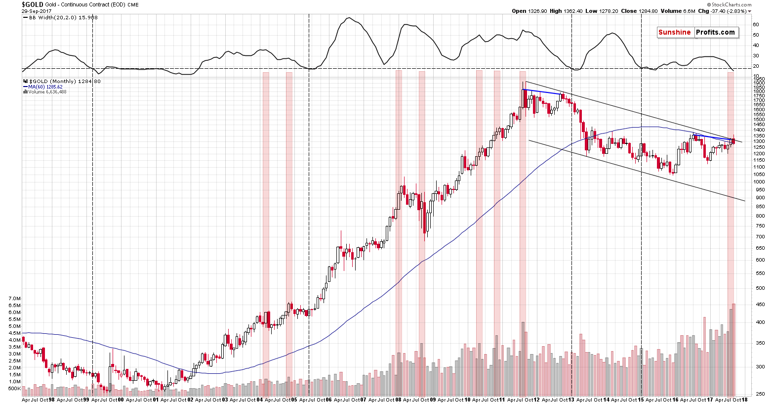
There are 2 important signals that we would like to discuss: the size of the monthly volume and the decline in the monthly volatility as measured by the Bollinger Band’s width (indicator in the upper part of the chart). There’s also one additional analogy that we’ll discuss later on. Let’s start with the former.
The August volume on which gold rallied in August was huge and it’s directly comparable to only one case from the past – the 2011 top. That’s the only case when gold’s monthly upswing was accompanied by volume that was similarly big. Since that was THE top, the implications here are naturally bearish.
However, there are more analogies that are also important. Considering other monthly volume readings, when gold moved higher on volume that was visibly bigger than the previous values, we get the same implication. We marked the similar cases with red rectangles. Two 2004 declines, the final part of the 2008 decline and – approximately – the 2008 top, the two 2010 corrective downswings, and finally the 2011 top were all accompanied by or preceded by huge monthly volume readings. In 3 cases (the 2008 top, both 2010 corrections) the signal was not precise as the decline started in 2 months not in the next month, but still, the efficiency of this signal in a strong bull market where gold rallied in the vast majority of months, is still remarkable.
The signal that we’re seeing right now is not a minor one – the volume was truly huge and thus the implications are not vague, but clearly bearish at this time.
The width of the Bollinger Bands – a proxy for gold’s volatility – confirms the above, by strongly suggesting that a huge move is just around the corner. We added a horizontal line on the BB width chart to better compare its current value to the previous cases when it was seen after a downswing. We marked those cases with vertical dashed lines. There were 4 similar cases: in early 1999 (right before the final downswing of the previous bear market), in mid-2005 (before one of the biggest and sharpest rallies started), in early 2013 (before the biggest and sharpest decline started), and in early 2015 (when the most recent huge decline started). Most of the signals were followed by very important declines even though gold was moving higher for most of the past 2 decades – the implications are once again bearish.
Finally, there’s an interesting analogy between the 2011/2012 tops and the 2016/2017 tops. We marked the link between them with the blue lines. Actually, that’s only one line – between the 2011 and 2012 tops, which is then copied into the current situation. Surprisingly – it fits, which means that in case of the monthly closing prices, the 2017 rally could be just as significant as the 2012 rally. In other words, it could indicate that this year’s move is just a fake rally that’s here to fool the gold bulls, just like the 2012 rally did. Of course, it could be the case that the current rally is a beginning of a new long-term uptrend, but the signals – including the long-term ones – and the way the precious metals sector responded to USD’s decline in the past few months strongly suggest otherwise.
Let’s discuss the last paragraph. The analogy regarding the blue line connecting both (2012 and 2017) tops just got much stronger and so did the bearish implications. The reason is that the similarity currently is even stronger. The month that followed both tops (that is tops in terms of monthly closing prices) featured both a temporary move to new short-term highs (above the previous month’s intraday high), and a decline to more or less the beginning of the previous month. In other words, in both cases gold first tried to break above last month’s high and ended up erasing last month’s price gains. This was indeed the case in both: October 2012 and September 2017. Based on the above similarity, the analogy is more complete and the link and implications are stronger. The latter are bearish as a huge decline followed the mentioned 2012 developments.
Moving to the analysis of volume, we already wrote about the similarity to the 2011 top, but based on the above chart, we would like to add another comment. Namely, the volume accompanying September’s decline was even higher than the one that we saw in August (we have a new record). This is extremely bearish for three separate, yet connected, reasons:
- The volume that accompanied the decline was bigger than the one that accompanied the decline.
- September’s price action in gold is one big monthly reversal (shooting star) candlestick which was confirmed by extremely high volume.
- Gold’s breakout above the declining long-term resistance line was invalidated and the invalidation took place on huge volume.
No matter how you slice it, what we saw last month in gold was extremely bearish, even though so many investors welcomed gold’s move above $1,300 with thundering ovation.
Let’s stay for a minute with the analogy to 2012-2013 and move the focus to the mentioned Bollinger Bands’ width – a proxy for volatility. It moved below the dashed line and when we saw a similar development back in early 2013 it was shortly before the dramatic plunge.
Summing up, the signals coming from gold’s monthly chart at this moment clearly point to lower gold prices in the future, especially that when it comes to gold investors’ excitement, $1,300 was the new $1,900. Naturally, the outlook can change as new information becomes available, but at this time it seems that it might be a good idea for one to be prepared for a big plunge in gold in the coming weeks and months.
We hope you enjoyed today’s analysis, even though it might appear controversial. If you’d like to receive follow-ups, we invite you to subscribe to our Gold & Silver Trading Alerts.
Thank you.
Sincerely,
Przemyslaw Radomski, CFA
Founder, Editor-in-chief, Gold & Silver Fund Manager
Gold & Silver Trading Alerts
Forex Trading Alerts
Oil Investment Updates
Oil Trading Alerts


