A daily rally in gold, daily decline, daily turnaround and other daily price developments are both interesting and dangerous. Interesting, because nothing is as exciting as a big intraday move. Dangerous, because they can make one too emotional about a given trading position and lose the focus on the big picture (forgetting about the forest by focusing on individual trees). In today’s analysis, we feature two analogies to the previous situations in gold which should make it clearer what’s likely to be seen in the coming months, even if a lot of daily price swings in both directions are about to be seen shortly.
The first analogy is the link between the 2011 top and the follow-up action, and the 2016 top and the follow-up action.
Let’s take a look at the chart for details (chart courtesy of http://stockcharts.com).
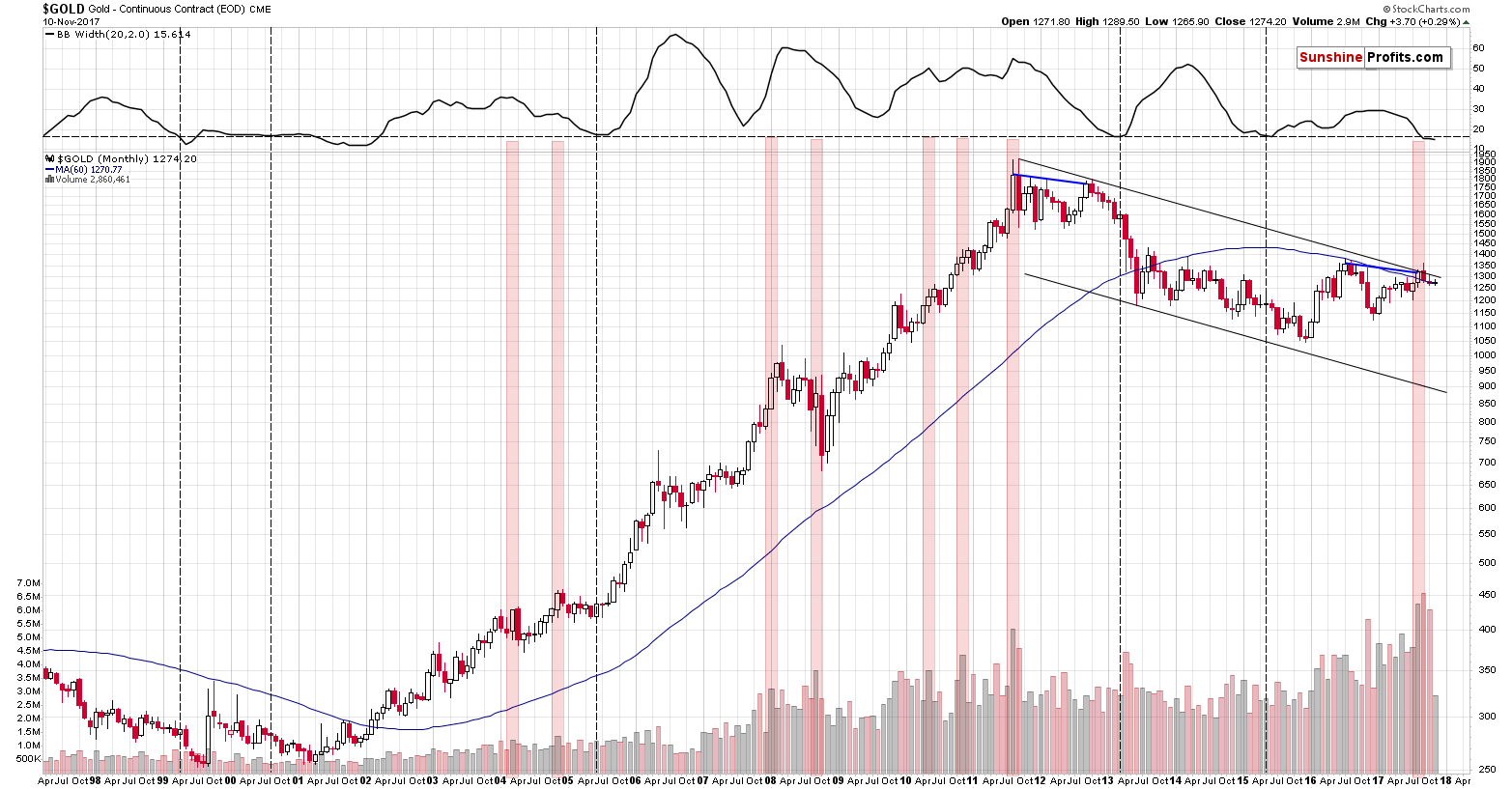

There are two important signals that we would like to discuss: the size of the monthly volume levels and the decline in monthly volatility as measured by the Bollinger Band’s width (indicator in the upper part of the chart). There’s also one additional analogy that we’ll discuss later on. Let’s start with the former.
The volume on which gold rallied in August was huge and it’s directly comparable to only one case from the past – the 2011 top (especially given huge volume that we saw in the next month when gold declined). That’s the only case when gold’s monthly upswing was accompanied by volume that was similarly big. Since that was THE top, the implications here are naturally bearish. Gold has already declined since that time, but since the follow-up action in 2011 and subsequent years were much more bearish, we should prepare ourselves for bigger declines in the coming months.
However, there are more analogies that are also important. Considering other monthly volume readings, when gold moved higher on volume that was visibly bigger than the previous values, we get the same implication. We marked similar cases with red rectangles. Two 2004 declines, the final part of the 2008 decline and – approximately – the 2008 top, the two 2010 corrective downswings, and finally the 2011 top were all accompanied by or preceded by huge monthly volume readings. In three cases (the 2008 top and both 2010 corrections) the signal was not precise as the decline started in two months, not in the next month, but still, the efficiency of this signal in a strong bull market where gold rallied in the vast majority of months is still remarkable.
The signal that we saw in the past months was not a minor one – the volume was truly huge and thus the implications are not vague, but clearly bearish at this time.
The width of the Bollinger Bands – a proxy for gold's volatility – confirms the above, by strongly suggesting that a huge move is just around the corner. We added a horizontal line on the BB width chart to better compare its current value to the previous cases when it was seen after a downswing. We marked those cases with vertical dashed lines. There were five similar cases: in early 1999 (right before the final downswing of the previous bear market), in mid-2000 (before an over 6-month decline) in mid-2005 (before one of the biggest and sharpest rallies started), in early 2013 (before the biggest and sharpest decline started), and in early 2015 (when the most recent huge decline started). The early 2001 similarity is not really similar because the BB width was almost flat beforehand. Most of the signals were followed by very important declines even though gold was moving higher for most of the past two decades – the implications are once again bearish.
Finally, there’s an interesting analogy between the 2011/2012 tops and the 2016/2017 tops. We marked the link between them with the blue lines. Actually, that’s only one line – between the 2011 and 2012 tops, which is then copied into the current situation. Surprisingly – it fits, which means that in the case of the monthly closing prices, the 2017 rally could be just as significant as the 2012 rally. In other words, it could indicate that this year’s move higher was just a fake rally that was here to fool gold bulls, just like the 2012 rally did. Of course, it could be the case that this year’s rally is a beginning of a new long-term uptrend, but the signals – including the long-term ones – and the way the precious metals sector responded to the USD’s decline in the past few months strongly suggest otherwise.
We first wrote about the above analogy on September 1 (after gold closed the month at $1,322 and many investors were thinking that $1,500 was just around the corner) and this analogy hasn’t been invalidated since that time. Conversely, it may seem striking (and it actually is) but this analogy continued and both September and October performance (and what we are seeing so far this month) serving as confirmations.
In September gold moved a bit above the previous high, but ultimately ended almost erasing the previous month’s rally (exactly what we saw in the first month after the 2012 top) and in October we saw back and forth movement that ultimately took gold a bit lower (again, in perfect tune with what happened two months after the 2012 top). So far in November we only saw little strength in gold and then a move back down – which is in tune with the third month after the 2012 top.
Still, will gold’s decline continue at a similarly slow pace? Based on the width of the Bollinger Bands – not necessarily. The latter are already at the level which was seen right before the sharpest part of the decline, so we could have a very bearish surprise any week now.
The implications are therefore even more bearish than they seem based on the analogy in price and volume. However, that’s not the only long-term analogy that seems to be in place right now. We would also like to remind you about the analogy that we discussed over a year ago – the analogy to what happened with gold in early 80s.
You can read the entire analysis using the link above – we quote just the key part below along with gold’s chart and gold’s price in the early 80s:
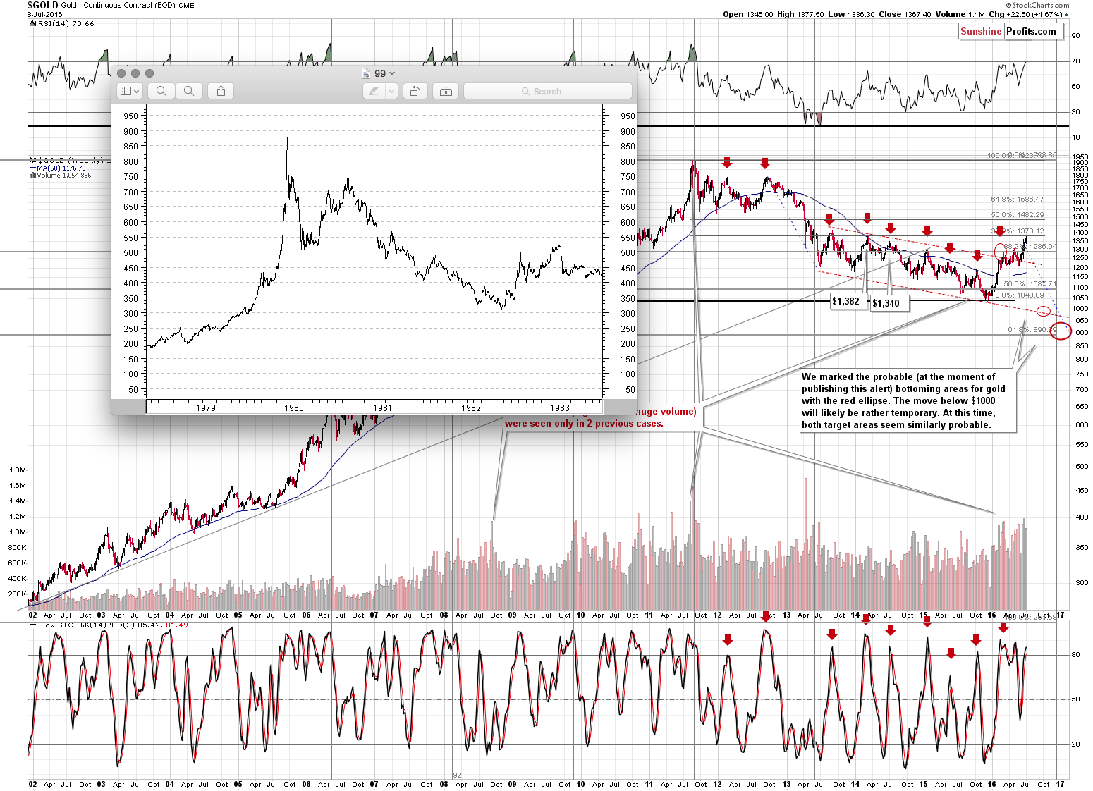
(…) let us re-emphasize that gold tends to repeat its price moves. At times it does it to the letter, but in most cases it is the shape of the move that matters the most. This self-similarity pattern phenomenon can provide a roadmap of the following events – if we detect that we have one that is (Fractalyzer does that automatically, but some things can be also detected manually). There are multiple similarities in the pattern: the parabolic upswing, the 2 tops that followed it, the initial big decline after a breakdown below the initial low, followed by a less steep decline. In both cases after the “final” bottom, the initial rally was very sharp, then we saw some sideways movement and then an additional rally a bit above the previous high.
The above makes the 2 cases very similar already, but that’s not all there is to it. Both post-bottom rallies took a little more than 6 months before the decline resumed. How high did gold rally initially in both cases? More or less to the first visible local high.
The pattern is from the end of the previous bull market (1980 top) and what followed it and while we don’t think the bull market is completely over this time, the emotions that accompanied investors in 1980 are similar to those at the 2011 top. Consequently, there are good reasons to think that the price patterns after these tops can be similar.
What does the similarity mean? That the price pattern is likely to continue, so the follow-up action in the price pattern from the past can tell us a lot about what’s likely to follow.
What is likely to happen next? The same thing – or something very similar to it – that happened in the past after this pattern. In the past, gold rallied only a little above the previous high (the one that formed after the initial sharp rally) and then it topped. After that gold moved to new lows.
(…)
How far did gold decline in 1983 after the top? It finally moved to new lows, but initially it declined more or less to the previous local bottom and applying this to the current situation provides us with $1,200 as the initial target (over $150 lower than the current gold price).
With the benefit of hindsight, we know that gold indeed declined to $1,200 – and even some more. However, let’s keep in mind that if the analogy is to continue at least on an approximate basis, we should be prepared for gold moving to new lows (that is below the 2015 low).
Summing up, while the long-term signals may not be meaningful for the short term (different factors need to be taken into account in this case), the long-term analogies in gold suggest that investors should prepare themselves for a bigger decline in the following weeks and months.
We hope you enjoyed today’s analysis, even though it might appear controversial. If you’d like to receive follow-ups, we invite you to subscribe to our Gold & Silver Trading Alerts.
Thank you.
Sincerely,
Przemyslaw Radomski, CFA
Founder, Editor-in-chief, Gold & Silver Fund Manager
Gold & Silver Trading Alerts
Forex Trading Alerts
Oil Investment Updates
Oil Trading Alerts


