Let’s take an example. Assume that Sunshine Profits conducted a small poll among its Readers to find what precious metals investors prefer. This table shows the results: four people love gold, three adore silver, two like platinum and only one prefer palladium.
Table 1: Dot plot displaying the results of the hypothetical poll about the preferred metal among Sunshine Profits’ Readers.
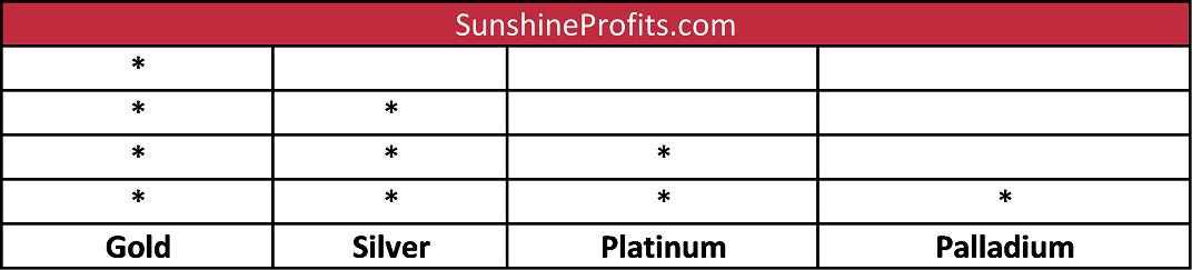

As one can see, the dot plot was created by drawing a horizontal line with categories (to keep things simple, we made a table with categories put in columns) and a dot above the line for each investor who chose a particular precious metal.
Probably the most watched dot plot in real life is the Fed dot plot, which displays the projections of the 12 members of the FOMC. Each dot represents a member’s view on where the federal funds rate should be at the particular dates and in the long run. Let’s look at the dot plot from the FOMC meeting in June 2018.
Figure 1: June 2018 Fed dot plot.

As one can see, that dot plot includes projections for 2018, 2019, 2020, and longer term. Each shaded circle indicates the value (rounded to the nearest ? percentage point) of an individual participant’s judgment of the midpoint of the appropriate target range for the federal funds rate at the end of the specified calendar year or over the longer run. The chart shows that two members believed that the midpoint of the target range of the fed funds rate should be at 1.875 percent, five participants chose 2.125, seven – 2.375, and one – 2.625. Hence, the median is 2.375 percent – and this is what markets take as the most probable value of the federal funds rate at the end of 2018.
Dot Plot and Gold
What is the link between the dot plot used by the Fed and gold? The dot plot – or, actually, the changes in the dot plot – show the shifts in the US central bank’s stance. Thus, the analysis of the dot plots over time enables investors to determine whether the FOMC is leaning toward looser or tighter monetary policy, which, then, affects the gold prices. The example may be December 2015, when the Fed finally hiked its interest rates. However, the upward move was accompanied with more dovish dot plots, so the gold prices started to rise soon after the FOMC historical meeting.
Nevertheless, investors should be careful not to read too much of the dot plot. The chart shows the projections of all participants, even those non-voting. And the dot plot carries no names, so there is no way to determine which dots belong to the most important members, such as the Fed Chair Jerome Powell. Finally, investors should remember that the dot plots show individual views of appropriate monetary policy, so they should not be taken as the targeted values.
We encourage you to learn more about the gold market – not only about the link between the dot plot and the yellow metal, but also how to successfully use gold as an investment and how to profitably trade it. Great way to start is to sign up for our Gold & Silver trading Alerts. If you’re not ready to subscribe yet and are not on our gold mailing list yet, we urge you to sign up. It’s free and if you don’t like it, you can easily unsubscribe. Sign me up!


