During yesterday’s week, we saw breakdowns and major declines in all parts of the precious metals sector. Even the HUI to gold ratio broke below the key low. Yet, there is something that we saw based on last week’s closing prices that had 100% bullish efficiency in the past few years. What is it and how we can use this knowledge?
Before moving to the details of the above bullish sign, let’s check what changed in gold (charts courtesy of http://stockcharts.com).
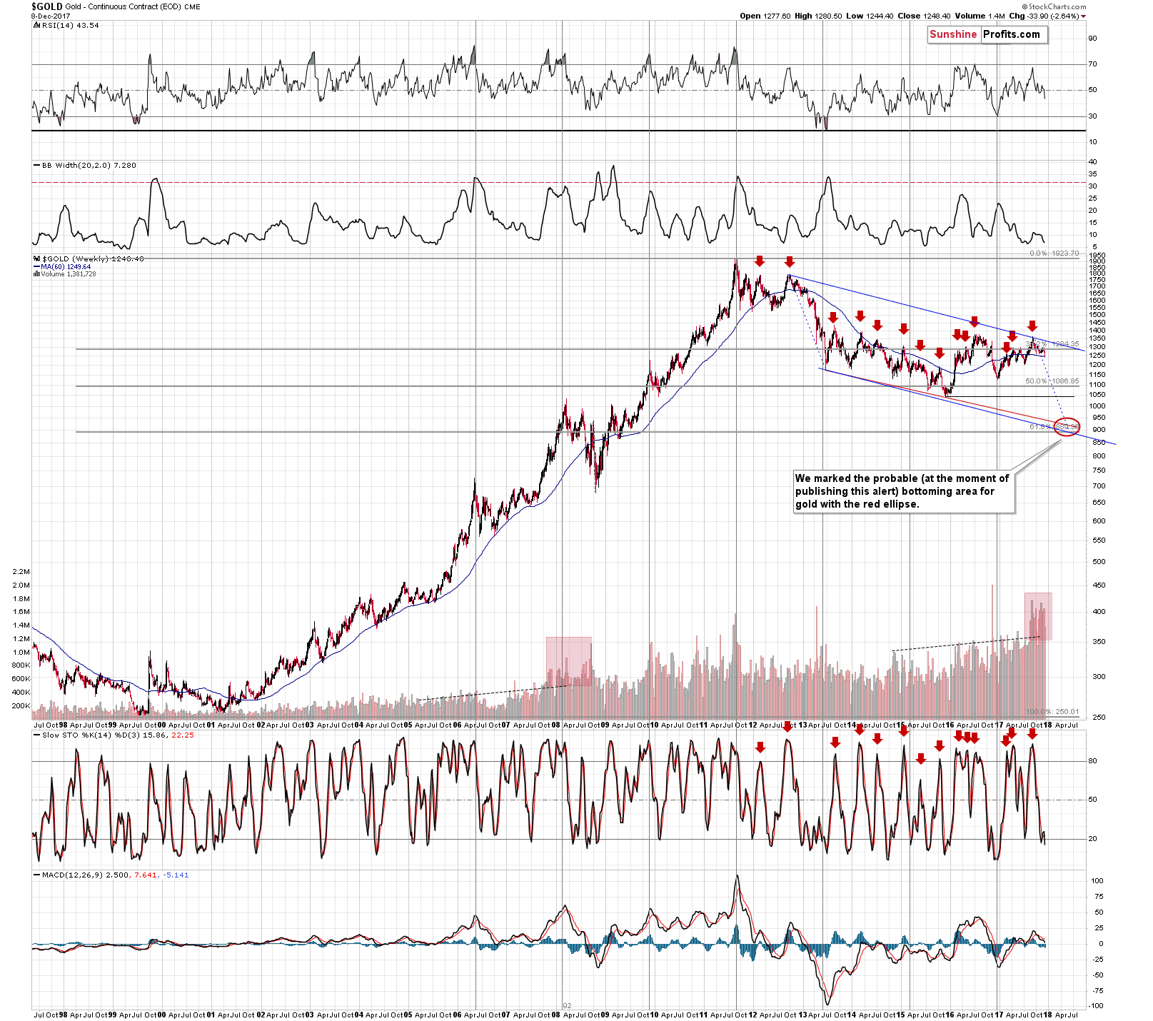

First of all, we would like to emphasize that the analogy to what we saw in 2008 before the big slide remains in place as the weekly volume levels continue to be exceptionally high. In other words, what we wrote about the above last week, remains up-to-date:
Yes, the volume has been growing almost constantly, but the 2008 and 2017 buildups in volume still stand out. The growth is much sharper than in other years and no other period is comparable to those years. Since the 2008 volume buildup was followed by a sharp decline in the precious metals sector, it seems that we might see something similar also this and/or the next year.
The thing that we would additionally like to point out on the above chart is that gold moved to (and closed the week below) the 60-week moving average. It had already moved close to this level in early October, but corrected shortly thereafter. Why do we mention this while discussing the long-term gold chart? Because on the above chart you can see something very similar in late 2012 and early 2013. Back then, gold’s final top was followed by a move to the 60-week MA, then we saw a correction, and then a move below the previous low and the 60-week MA. After that low we saw another corrective upswing that was a bit smaller than the previous one.
The implication here is that we could see even lower gold prices on a very short-term basis, then a correction that would not be very significant and then another big wave down. That’s in tune with what we’ve been expecting to see based on other factors, so the above simply serves as a confirmation.
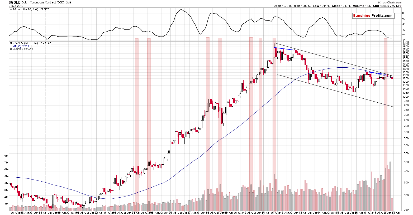
On gold’s monthly chart we can already see this month’s decline very visibly. The month is not over yet, so the implications are not clear, but we are featuring it because it shows that we were most likely correct about gold’s willingness to decline in the final part of November – it was unable to do so based on external factors, but it already caught up early this month.
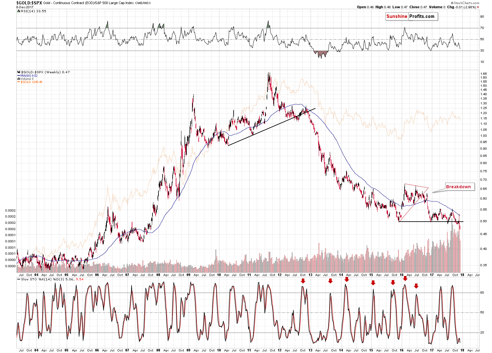
The gold to S&P 500 ratio is after a major, clearly visible breakdown and the implications are also major and clear – and bearish. While the short-term price swings may differ, the big moves are almost always aligned in the case of the above ratio and gold price itself. Consequently, the bearish implications for the following months are now even more significant.
On the above short-term chart, little changed based on Friday’s session and our previous comments on it remain up-to-date:
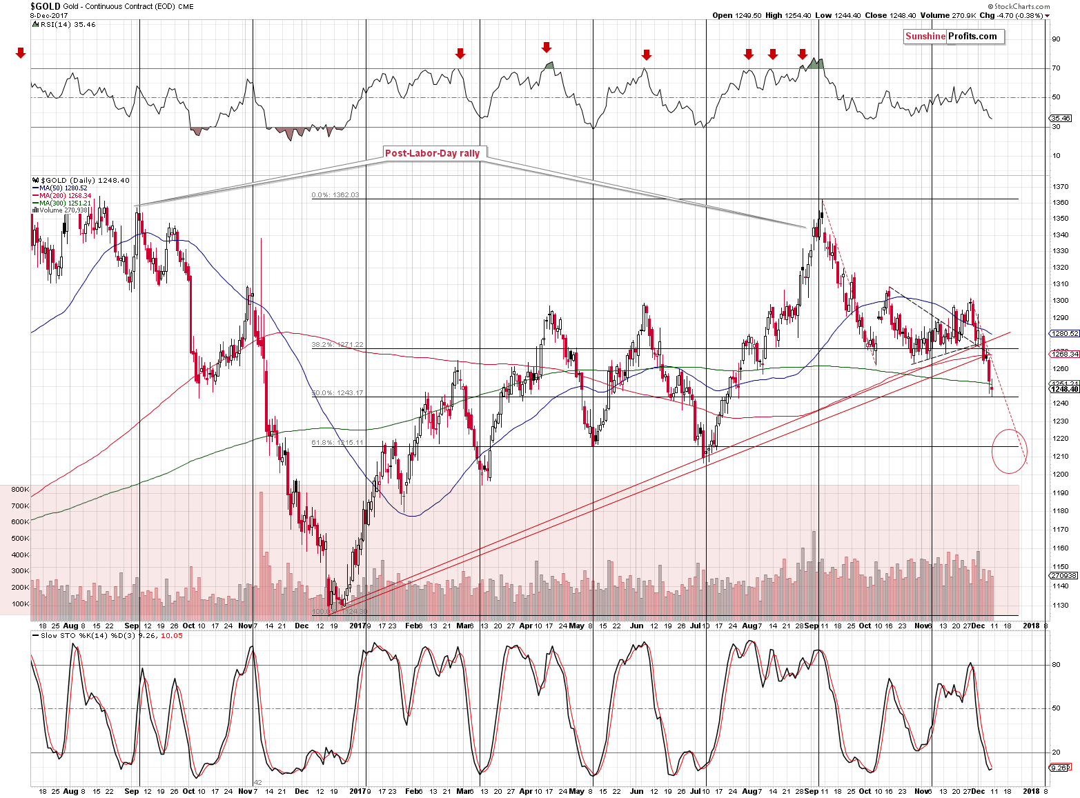
Gold moved to about $1,250 and the proximity of this level caused pauses several times this year, but it was never anything more than that – no major top or bottom formed very close to this level. The late February 2017 top could be viewed as exception, but it formed almost at $1,260 and since gold was about $15 below this level (temporarily, but still) yesterday, it doesn’t seem that the above is an important support anymore. Since gold didn’t use to bottom at the current levels, there’s little reason to think that it did so this time.
Gold almost reached the 50% Fibonacci retracement level yesterday, but this level is not strengthened by other important bottoms, so it’s not likely to trigger a major reversal. Slide to the 61.8% Fibonacci retracement or the March – May bottoms still appears more likely than an immediate rebound.
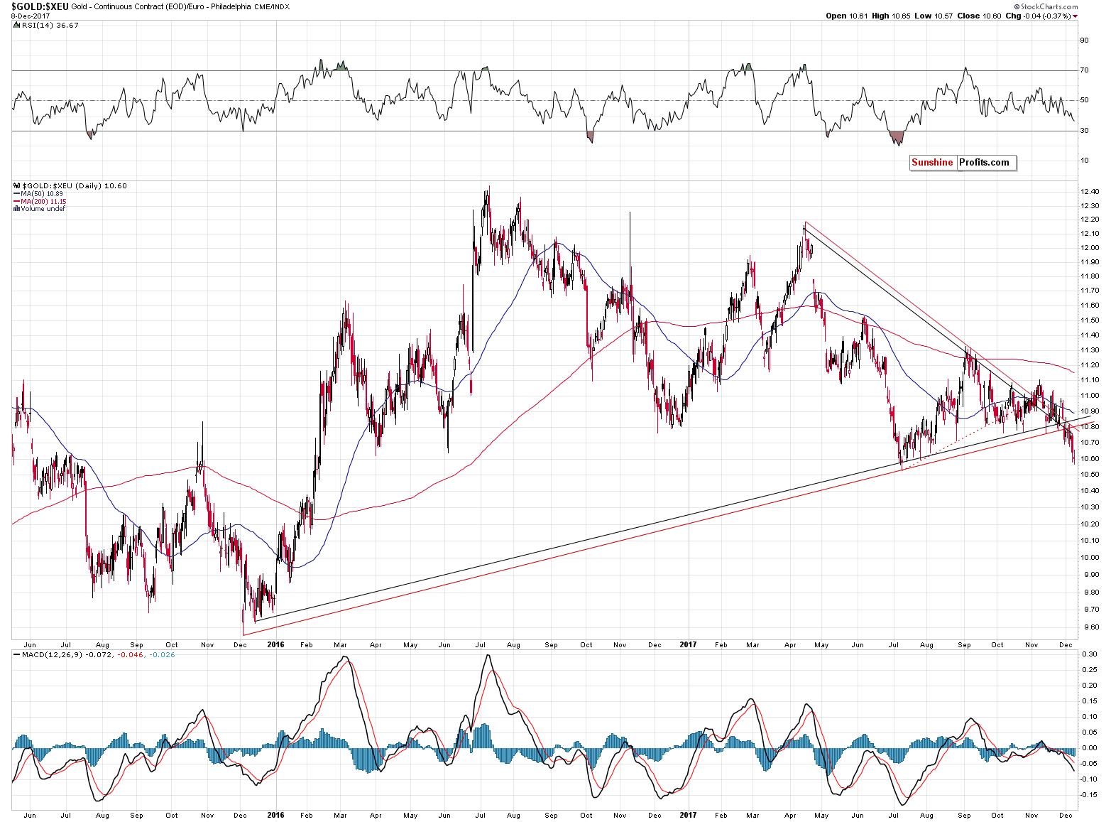
In terms of the euro, gold’s price is also after an important breakdown and the implications remain bearish for the following weeks.
Having discussed the situation on the gold market, let’s move to the currency sector. Namely, let’s take a look at the recent price changes in the Japanese yen.
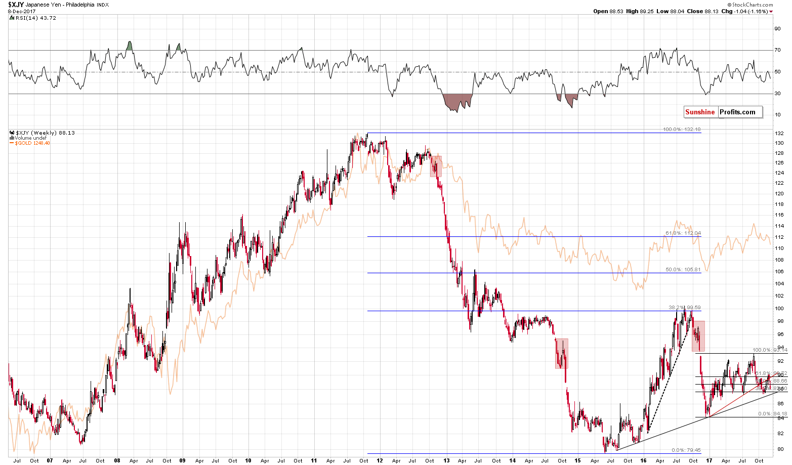
The reason that we’re featuring the above chart is that we would like to emphasize that there’s much more to the gold market than just the USD:JPY exchange rate. Every now and then we receive a message claiming that analyzing various parts of the precious metals market is pointless as it’s all about the yen. It’s not – the link between both markets is certainly present, but as you can see above, gold is already below the previous short-term low and the rising support lines (even in terms of the euro). At the same time, the Japanese yen is not below any of the mentioned levels.
Interestingly, the final part of the 2008 decline in gold was accompanied by the yen’s appreciation, so focusing on the currency market alone, one could be buying gold at the best shorting opportunity of the year.
The USD:JPY exchange rate is important, but many other factors should be kept in mind as well.
This brings us to one of the “other factors” that we described in the opening paragraph of today’s article. As we’ve already described, there are tens of bearish factors currently in place, but there’s one thing that has bullish implications and that appears to be quite efficient.
What is it?
Platinum’s huge weekly decline.
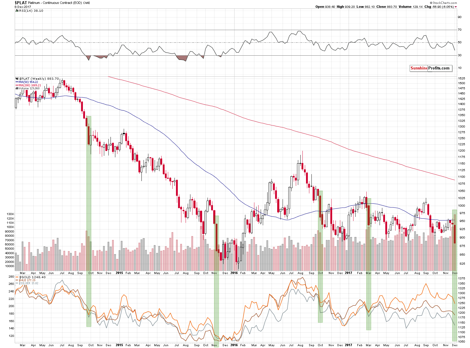
As odd as it may sound, whenever platinum declined in a very profound way (about 5% in a week), it meant that either a corrective upswing was about to start in the following week (2014, 2016) or that a decline had just ended (2015, March 2017). We’ve seen this phenomenon 4 times in the recent years and in each case, it had bullish implications. 4 out of 4, meaning 100% efficiency is not something that should be ignored.
Does it mean that the precious metals sector will soar immediately? No. The above chart is based on weekly candlesticks in the case of platinum and weekly closing prices in the case of gold, silver and the HUI Index that are visible in the lower part of the above chart. Consequently, whatever implications the above chart has, they are in terms of the next week’s closing prices. So, gold, silver and mining stock are likely to end the next week higher, but not necessarily rally in its first part.
We previously mentioned that the Fed interest rate decision day could mark a turning point or we could see the interim bottom very close to it. The above chart supports this outlook and it suggests that we should be prepared to either exit the short positions or to switch to long ones. We are considering both options and which decision we take will depend on the confirmations that we get in the meantime.
Summing up, there multiple signals that point to lower precious metals prices in the coming weeks, but there are also signs that point to higher prices in the short term. The scenario that seems to fit most signals is the one in which the precious metals market forms a temporary (!) bottom sometime this week, rallies for a bit and then starts another major slide. There are many factors that come into play at this time and we’ll keep monitoring them.
We hope you enjoyed today’s analysis, even though it might appear controversial. If you’d like to receive follow-ups, we invite you to subscribe to our Gold & Silver Trading Alerts.
Thank you.
Sincerely,
Przemyslaw Radomski, CFA
Founder, Editor-in-chief, Gold & Silver Fund Manager
Gold & Silver Trading Alerts
Forex Trading Alerts
Oil Investment Updates
Oil Trading Alerts


